
When we want to carry out a statistical or other study, an essential step is to obtain and process data.
Here, we’re talking about obtaining data sets.
There are many possibilities available for this. But Quandl offers a large collection of datasets from various sources. It also offers “Collections”, which are thematically aggregated datasets.
An API and interfaces for Excel, Python, Ruby and R are available.
The R package is easily installed and loaded using the following code:
install.packages("Quandl")
library(Quandl)
It is then possible to retrieve any dataset as follows:
mydata = Quandl("source/dataset")For example, to retrieve the EONIA rates published by the Banque de France, simply do:
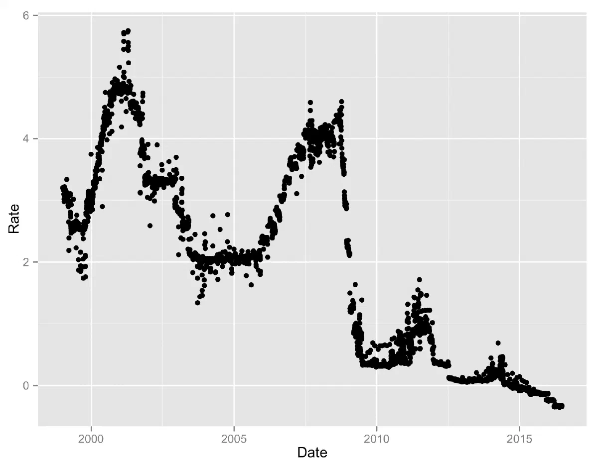
eonia = Quandl("BOF/QS_D_IEUEONIA")
str(eonia)
'data.frame': 4255 obs. of 2 variables:
$ Month: Date, format: "2015-08-19" "2015-08-18" "2015-08-17" "2015-08-14" ...
$ Date : num -0.119 -0.126 -0.122 -0.13 -0.129 -0.124 -0.117 -0.129 -0.119 -0.116 ...

- attr(*, "freq")= chr "daily"
The recovered data contain 4255 observations of two variables: Month and Date. The variable names are wrong. They should be Date and Rate. We can easily rename them as follows:
colnames(eonia)<-c("Date","Rate")We can then plot the graph using ggplot2:
library(ggplot2)
qplot(Date, Rate, data=eonia)